Tuesday, April 27, 2010

The current economic recession

The current economic recession

“The financial crisis of 2007-09 is widely viewed as the worst financial disruption since the Great Depression. However, the accompanying economic recession was mild compared with the Great Depression, though severe by postwar standards,” (Wheelock, 2010). The Great Depression occurred in August 1929 through June 1933, a period of 110 months.

The National Bureau of Economic Research defines economic recession as a significant decline in the economic activity spread across the economy, lasting more than a few months (http://recession.org). Compared to the previous recessions it is evident that the current recession has one of the longest duration as shown in figure 1 below. A brief history of US economic recession can be found at http://recession.org.

Figure 1. The US economic recession periods after the Great Depression of 1929-33.

The current economic recession has negatively affected many parts of industry. Here we will look at agriculture and manufacturing. As it is always the case in economics; high demands – higher the price and vice-versa. The cost of vegetable went high and this lead to low production from the farms. The low production in turn resulted in the food prices slightly going up. The increased food /vegetable prices resulted in a decline in the consumption per capita. This is indicated in the below graph, fig. 2. It can be observed that during the non-economic recession years the consumption were higher and they usually decline sharply when the recession occurs.


Figure 2. The US per capita use of vegetables since 1970

The manufacturing industry has been severely affected by the recession. The figure 3 below shows the economic recession periods and the average hours spent in manufacturing since 1939. It can be noted that the weekly hours of manufacturing respond to the recession by dropping sharply. This could be due to the fact that companies try to reduce costs by reducing the hours of operations. In this way the utility bills and over time claims are reduced.

Figure 3. Average Hourly weekly, manufacturing

As a result of cutting down the hours of operation and reducing the workforce the production of goods gets affected in a negative way, i.e. it declines. From fig. 4 it is evident that the US manufacturing industry has not yet fully recovered from the recession.


Figure 4. Durable good manufacturing (US)

Although the recession period is not yet over there are some positive signs that things may improve. Fig 2 and fig 3 show some slight and promising rise in the vegetable consumption and hours in manufacturing respectively. This could be a sign that the economy is on its way to recovery.

The other figure (4) still shows no sign of improvement. This maybe due to the low demand of the durable goods, as the consumers are still recovering from the recession panic.

It is important to note that these figures are the average for the US; the situation could be very different in the 50 states. For example Vest (2009) reported, “Arizona’s economy is one of the most volatile in the nation. It grows much faster than the nation during expansions, but suffers equally with the nation during recessions”.


Reference:

http://recession.org

http://research.stlouisfed.org/fred2/

http://usda.mannlib.cornell.edu/MannUsda/homepage.do

Tuesday, April 20, 2010

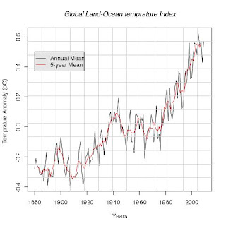
hockey stick plot2

The data used to create this graph was obtained from the following website: http://cdiac.ornl.gov/ftp/trends/temp/jonescru/global.txt

The reason why I chose to use this data is that it is well displayed and organized. It is organized according to the months. This makes it easier for one to make computations like mean for a particular season. The observation that I have made is that the results are more or less the same as those in the previous graph (in this blog) and it was challenging to come up with a different way of visualizing this data.

A review hockey stick debate

The great climate debate

A review hockey stick debate

How full is a bucket of indeterminate size, with unknown capacity and a questionable number of leaks, that is being refilled at an unknown rate that you cannot easily see? (Grubb 1993)

The hockey stick debate, or climate change debate is mostly driven and heavily relies on the information obtained from models. The main question is “how accurate are these models?” In the 1970s some scientist were concerned about global cooling (Sudhakara & Assenza 2009). The pattern or the trend has changed; the issue now is global warming. This issue is of hot debate among the scientists and policy makers. According to Sudhakara & Assenza (2009) this hot debate has divided debators into two catergories; the skeptics and supporters. Using the models to estimate/reconstruct the temprature changes of the past 1000 years the skeptics find it difficult to blame human activities on the climate changes. For example the models show that the The Little Ice Age was preeceded by the Medieval Warming from 950 to 1300 AD. The skeptics are now saying if the world was warmer in 1200 AD than today, and far colder in the year 1400 AD, why would we blame current temperatures trends on auto exhausts?

The supporters, on the other hand, are of the view that the climate is influenced by multiple contributing factors, including natural causes. Without adopting a mono-causal point of view, many supporters nonetheless argue that the theory of human influence on the climate is well established and that it would be irresponsible to wait with action (Sudhakara & Assenza 2009).

Clearly a totally comprehensive model cannot be developed, except in the sense that we are already living in it and will in due course find out the results of whichever rate of experimentation we choose to impose (Sudhakara & Assenza 2009).

Despite the fact that there are some great differences between the scientists on this issue of climate change the policy makers still rely of the scientific finding to make their decisions. The question is how do they choose the information to use? This is where data presentation and visualization come into play. A well-presented and visualized data can have an impact on the audience even if the data itself doesn’t say much (or meaningless). For example climate change has been related to conflict by officials of international organizations for research on the environment, such as Kevin Noone, Director of the International Geosphere Biosphere Programme (IGBP) who made the extraordinary comment that ‘‘most conflicts have something to do with the climate’’ (Nordås & Gleditsch 2007). One can easily deduce from this statement Kevin Noone’s conclusion was based on some kind of data that was presented to him. It is also very important to note that he has used the phrase “have something to do”. This phrase does not imply that conflict is caused by climate change nor related to climate change. The data that was presented could have had good correlations between areas in wars/conflict and climate change but that does not necessarily means one causes the other. It could be a mere coincidence.

Nordås & Gleditsch (2007) suggested that there could be chains from climate change to conflict. The starting-point for most of these is that climate change results in a reduction of essential resources for livelihood, such as food or water, which can have one of two consequences: those affected by the increasing scarcity may start fighting over the remaining resources. Alternatively, people may be forced to leave the area, adding to the number of international refugees or internally displaced persons. Fleeing environmental destruction is at the outset a less violent response to adverse conditions than armed conflict or genocide. But when the migrants encroach on the territory of other people who may also be resource constrained, the potential for violence rises (Nordås & Gleditsch 2007).

The other issue of importance is to relate catastrophic events with climate change. Is there any relationship between the two or are the catastrophes occurring randomly? Hay et al. report a careful statistical analysis which shows that in four highland locations in East Africa, where malaria has been increasing in recent decades, there was no evidence that warming has actually occurred, either during the study period or, indeed, during the whole of the last century. Instead, the authors suggest that the causes of malaria resurgence should be sought elsewhere such as changes in land use or human demography, or increased resistance to anti-malarial drugs.


Reference:

Grubb, M., 1993. Policy modelling for climate change : The missing models. Energy Policy, 21(3), 203-208.

Nordås, R. & Gleditsch, N.P., 2007. Climate change and conflict. Political Geography, 26(6), 627-638.

Sudhakara Reddy, B. & Assenza, G.B., 2009. The great climate debate. Energy Policy, 37(8), 2997-3008.

Monday, April 19, 2010

R.Code for creating a hockeystickGraph


#Reading the data from the webpage
#and making it suitable for plotting by skipping some non numeric characters and strings
clm<-read.table("http://data.giss.nasa.gov/gistemp/graphs/Fig.A2.txt", sep="", skip = 4, nrows = 131, na.strings = "*")

#Plotting the first set of data (first column)
plot((clm[,c(1,2)]), type = "l", xlab = "Years" , ylab = "Temprature Anomaly (oC)", main = "Global Land-Ocean temprature Index", col = "black")

#plotting the second columns od data
lines((clm[,c(1,3)]), lty = 1, col = "red")

#creating the legend and adding it to the plot
legend(1880, 0.5, c("Annual Mean", "5-year Mean"), col = c(1,2), lty = c(1, 1), merge = TRUE, bg = 'gray90')

#saving the plot in jpeg fomart
dev.copy(jpeg, "/Users/kdintwe/Documents/Classes/Geog_299B/blog_docs/hockeyStickGraph.jpg")

dev.off()

#saving the plot in pdf fomart
dev.copy(pdf, "/Users/kdintwe/Documents/Classes/Geog_299B/blog_docs/hockeyStickGraph.pdf")

dev.off()

Thursday, April 8, 2010

Wednesday, April 7, 2010

Fire data Time series analysis

http://www.newmediastudio.org/zaca/

Tuesday, April 6, 2010

Strategies For The Visualization Of Geographic Time-Series Data

utpjournals.metapress.com/index/U558H73765778U31.pdf

Visualization of geographically related multidimensional data in virtual 3D scenes

linkinghub.elsevier.com/retrieve/pii/S0098300499000369

Animated Transitions in Statistical Data Graphics

http://vis.berkeley.edu/papers/animated_transitions/

Data visualization in Physical Geography

Scale is a very important component of studies in physical geography. Data is usually collected from sample areas or study areas. During analysis the data is extrapolated over the entire study area using some statistical analysis. This is scaling up of the data. The point data is blown out and used to represent a larger area.

Since the original data is usually point data; X and Y coordinates it is very important to know exactly where that point is located. This is achieved through the use of GIS software. The display of point data in the GIS software enables the observer or the analyst to make better assumptions, interpretations and conclusions of the data. For example, if one is looking at fire occurrences in a particular area it would be interesting to overlay the fire data with roads, rivers and settlements to see how they are related.

One of the most useful tools of data visualization is time series analysis. This technique enables us to follow a particular event over a long period. In so doing one can investigate the many reasons why that event is happening. The following are some of the events that can be investigated using the time series analysis.

Fire frequency outbreaks

Floods occurrences

Land cover/land use change

By overlaying different types of related datasets for different time events can help in understanding the causes of such events. For example; fire data time analysis may show that fire outbreaks are common in winter, and occur mostly near settlements. With this kind of information it would be easier to come up wit early warning system, and be prepared in advance before the fire seasons.

Similarly the same thing applies to the land cover/land use changes. Time series analysis is the best tool to show how the changes have occurred.