Monday, May 24, 2010

Geoda, R, ArcMap

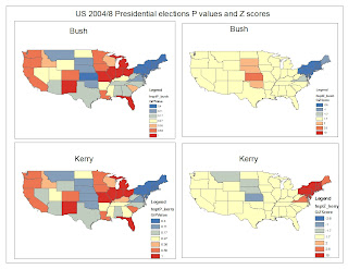
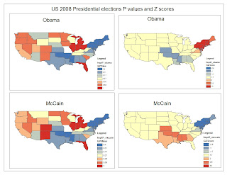
The choice of software to use depends mostly on the objective of the project. For example, one may be asked to create a map showing the distribution of population of the US voters. In this case ArcMap would be an ideal instrument to use. It can generate very informative maps. The following examples illustrate this point. Data from the past presidential votes (2004/8) have been analyzed to determine the density of votes using the Z scores and P values. The results have been successfully visualized in the form of a map, for each presidential candidate. This makes it to compare the data easily.
Z Scores and P values for the US presidential votes 2004/8

The Z scores and p-values are measures of statistical significance that tell you whether to reject the null hypothesis, feature by feature. They, in effect, indicate whether the apparent similarity (or dissimilarity) in values for a feature and its neighbors is greater than one would expect in a random distribution. The Z score is based on the Randomization Null Hypothesis computation. A high positive Z score for a feature indicates that the surrounding features have similar values (either high values or low values). A low negative Z score for a feature indicates a statistically significant (0.05 level) spatial outlier (http://webhelp.esri.com/arcgisdesktop/9.3/index.cfm?TopicName=Cluster_and_Outlier_Analysis:_Anselin_Local_Moran%27s_I_%28Spatial_Statistics%29).
Fig.1. Indicates the P - values and Z Scores for both Kerry and Bush during the 2004 votes


Fig.2. Indicates the P - values and Z Scores for both McCain and Obama during the 2008 votes

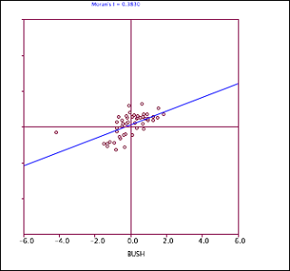
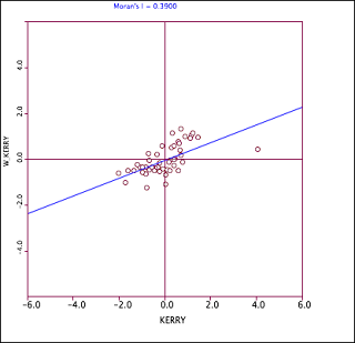
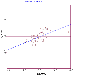
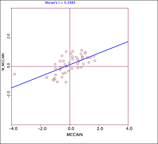
Geoda, on the other hand is a very useful tool when it comes to visualizing the correlation between sample. The following figures demonstrate the usefulness of this tool (Geoda).


Fig.3 Moran's plot for Bush


Fig 4. Moran's plot for Kerry


Fig 5. Moran's plot for Obama


Fig 6. Moran's plot for McCain

R, a statistical language is very useful and powerful when it comes to data analysis. Here, in most cases, the user is limited by his/her imagination. The user has the liberty to choose any kind of plot to display the results. R can also be used to generate map, but it is not very good at that.

Conclusion

Depending on the objective of the project the user has liberty to choose any programme to analyze and visualize data.

Tuesday, May 18, 2010

GIS in R

The figures below (map 1 to map 4) indicate each agricultural districts in Botswana. They also show nearest neighbors for each district. This information is very useful in terms of resource allocation. Nearest neighbors may be able to share some resources like transport and personnel. e.g. one officer being responsible for more that one district.
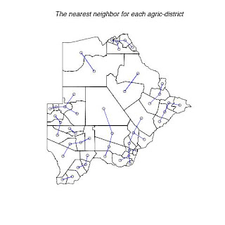
Fig. 1. Shows each district with its nearest neighbor.
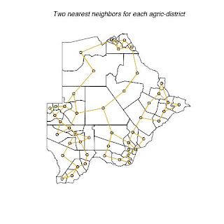
Fig. 2. Shows each district with its two nearest neighbors.
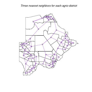
Fig. 3. Shows each district with its three nearest neighbors.
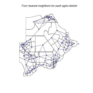
Fig. 4. Shows each district with its four nearest neighbors.

The following four maps below (map 5 to map 7) indicate each agricultural districts in Botswana. They also show threshold distance between the district/neighbors. This information is very useful in terms of transportation, communication and resource allocation. Nearest neighbors may be able to share some resources like transport and personnel. e.g. one officer being responsible for more that one district. It is also easier and cheaper for officers to communicate or visit their nearest neighbors. Officers can share resources easily with their nearest neighbors.
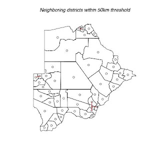

Fig. 5. Shows districts that have a threshold of 50km with their neighbors.
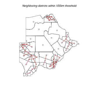

Fig. 6. Shows districts that have a threshold of 100km with their neighbors.
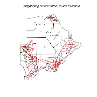
Fig. 7. Shows districts that have a threshold of 150km with their neighbors.
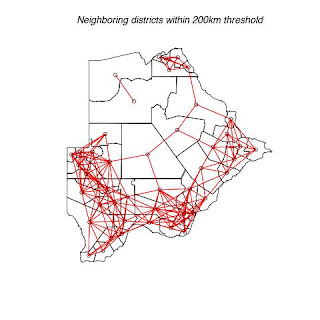
Fig. 8. Shows districts that have a threshold of 150km with their neighbors.
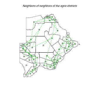
Fig. 9. Indicate the neighbor of neighbors for each district
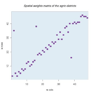
Fig 10. The spatial weights for each district
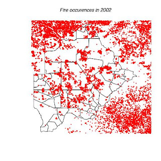

Fig 11. Indicates the location of bush fires that occurred in 2002.
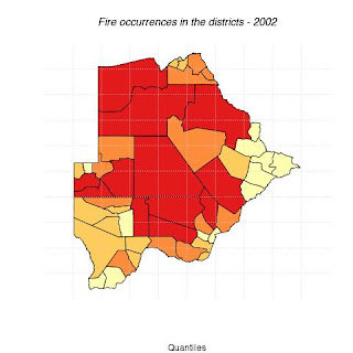
Fig 12. Indicate the intensity of bush fire in each district. The more reddish the color the higher the fire outbreak frequency.
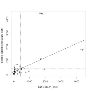

Fig 13. The moran test for the fire outbreak intensity for each district.

I have a problem of explaining figures 10 and 13. I don't know what spatial weight matrix is. Also, I haven't yet understood the moran test.

#The following is the code used to create the above figures and graphs
#Install and load the following packages:

library(spdep)# spatial analysis functions in R;
library(maptools)# used to read shapefiles in R;
library(classInt)# for classifying continuous data;
library(RColorBrewer)# provides nice color schemes for mapping

#Explore the functions of these packages via:

help(spdep)
help(maptools)
help(classInt)
help(RColorBrewer)

#Input the botswana shapefile (botsdistricts.shp) into R;

#read shapefile data into R and set projection to geographic coords, long/lat;
?readShapePoly
botdistrct <- readShapePoly("/Users/kdintwe/Rworkspace/gis_data/fire2002.shp",proj4string=CRS("+proj=longlat"))
#summarize new R object;
summary(botswana)
plot(botdistrct)

#view or display the coordinates
coordinates(botdistrct)

#put centroids into a file and make it a data frame;
centers <- coordinates(botdistrct)
centers <- data.frame(centers)

#plot the coordinates
points(centers,col="blue",cex=0.3, pch = 19)
text(centers,labels=rownames(centers),cex=1.5)

###################################################
#Loading fire data
fire <- readShapePoints("/Users/kdintwe/Rworkspace/gis_data/fire.shp",proj4string=CRS("+proj=longlat"))

plot(fire, add = T, cex = 0.3, col = "red", pch = 19)
#Also can use readShapeLines for line-shape-files
plot(botdistrct, add =T)
title(main = "Fire occurences in 2002")
dev.copy(jpeg, "/Users/kdintwe/Documents/Classes/Geog_299B/blog_docs/wk8/botsfires.jpg")
dev.off()

###################################################

#MEASURING SPACE: nearest neighbors & distance-based neighbors

botdistrct.centers = coordinates(botdistrct)

###################################################
#how many neighbors, k, are of interest? Why?
k=1

#determine the k nearest neighbors for each point in afghan.centers;
knn1 = knearneigh(botdistrct.centers,k,longlat=T)

#create a neighbors list from the knn1 object;
botdistrct.knn1 = knn2nb(knn1)

#map k-nearest neighbors;
plot(botdistrct)
plot(botdistrct.knn1, botdistrct.centers,col="blue",add=T)
title(main = "The nearest neighbor for each agric-district")
dev.copy(jpeg, "/Users/kdintwe/Documents/Classes/Geog_299B/blog_docs/wk8/k1.jpg")
dev.off()
###################################################
k=2
knn2 = knearneigh(botdistrct.centers,k,longlat=T)
botdistrct.knn2 = knn2nb(knn2)
plot(botdistrct)
plot(botdistrct.knn2, botdistrct.centers,col="orange",add=T)
title(main = "Two nearest neighbors for each agric-district")
dev.copy(jpeg, "/Users/kdintwe/Documents/Classes/Geog_299B/blog_docs/wk8/k2.jpg")
dev.off()
###################################################
k=3
knn3 = knearneigh(botdistrct.centers,k,longlat=T)
botdistrct.knn3 = knn3nb(knn3)
plot(botdistrct)
plot(botdistrct.knn3, botdistrct.centers,col="purple",add=T)
title(main = "Three nearest neighbors for each agric-district")
dev.copy(jpeg, "/Users/kdintwe/Documents/Classes/Geog_299B/blog_docs/wk8/k3.jpg")
dev.off()
###################################################
k=4
knn4 = knearneigh(botdistrct.centers,k,longlat=T)
botdistrct.knn4 = knn4nb(knn4)
plot(botdistrct)
plot(botdistrct.knn4, botdistrct.centers,col="navyblue",add=T)
title(main = "Four nearest neighbors for each agric-district")
dev.copy(jpeg, "/Users/kdintwe/Documents/Classes/Geog_299B/blog_docs/wk8/k4.jpg")
dev.off()
###################################################

#Turn 'Recording' on and change the k value to 2, 3, 4 and 5. What happens?

#Neighbors based on distance in kilometers;
d = 100

#create a distance based neighbors object (afghan.dist.100) with a 100km threshold;
botdistrct.dist.100 = dnearneigh(botdistrct.centers,0,d,longlat=T)

#map neighbors based on distance;
plot(botdistrct)
plot(botdistrct.100,botdistrct.centers,add=T,lwd=1,col="red")
title(main = "Neighboring districts within 100km threshold")

#obtain summary report of botdistrct.dist.100 object
summary(botdistrct.100)
dev.copy(jpeg, "/Users/kdintwe/Documents/Classes/Geog_299B/blog_docs/wk8/d100km.jpg")
dev.off()
#Vary the distance threshold and map and summarize your results.
###################################################
d = 150
botdistrct.dist.150 = dnearneigh(botdistrct.centers,0,d,longlat=T)
plot(botdistrct)
plot(botdistrct.dist.150,botdistrct.centers,add=T,lwd=1,col="red")
title(main = "Neighboring districts within 150km threshold")
summary(botdistrct.dist.150)
dev.copy(jpeg, "/Users/kdintwe/Documents/Classes/Geog_299B/blog_docs/wk8/d150km.jpg")
dev.off()
###################################################
d = 50
botdistrct.dist.50 = dnearneigh(botdistrct.centers,0,d,longlat=T)
plot(botdistrct)
plot(botdistrct.dist.50,botdistrct.centers,add=T,lwd=1,col="red")
title(main = "Neighboring districts within 50km threshold")
summary(botdistrct.dist.50)
dev.copy(jpeg, "/Users/kdintwe/Documents/Classes/Geog_299B/blog_docs/wk8/d50km.jpg")
dev.off()
###################################################
d = 200
botdistrct.dist.200 = dnearneigh(botdistrct.centers,0,d,longlat=T)
plot(botdistrct)
plot(botdistrct.dist.200,botdistrct.centers,add=T,lwd=1,col="red")
title(main = "Neighboring districts within 200km threshold")
summary(botdistrctn.dist.200)
dev.copy(jpeg, "/Users/kdintwe/Documents/Classes/Geog_299B/blog_docs/wk8/d200km.jpg")
dev.off()
###################################################

#Spatial lags, i.e., neighbors of neighbors, can also be determined;

#determine 2nd order lags, or neighbors of neighbors, in the botdistrct.knn2 object;
botdistrct.lags = nblag(botdistrct.knn2,2)

#map 2nd order lags;
plot(botdistrct)
plot(botdistrct.lags[[2]],botdistrct.centers, add=T,lwd=1.5,col="green",lty=2)
title(main = "Neighbors of neighbors of the agric-districts")
dev.copy(jpeg, "/Users/kdintwe/Documents/Classes/Geog_299B/blog_docs/wk8/neighborneighbor.jpg")
dev.off()

#visualize the spatial weights matrix that summarizes connectivity
#define the matrix, ie number of columns and rows;

w.cols = 1:48
w.rows = 1:48

#create spatial weights matrix from neighbor object

w.mat.knn = nb2mat(botdistrct.knn1, zero.policy=TRUE)

#return binary spatial weights matrix
w.mat.knn

#visualize binary spatial weights matrix
image(w.cols,w.rows,w.mat.knn,col=brewer.pal(3,"BuPu"))
title(main = "Spatial weights matrix of the agric-districts")
dev.copy(jpeg, "/Users/kdintwe/Documents/Classes/Geog_299B/blog_docs/wk8/spatweigtmatrx.jpg")
dev.off()

#create and visualize distance-based spatial weights matrix;
w.mat.dist = nb2mat(botdistrct.dist.200, zero.policy=TRUE)
image(w.cols,w.rows,w.mat.dist,col=brewer.pal(9,"PuRd"))
title(main = "distance-based spatial weights matrix of the agric-districts")
dev.copy(jpeg, "/Users/kdintwe/Documents/Classes/Geog_299B/blog_docs/wk8/distbasedspwt.jpg")
dev.off()

#read Botswana fires shapefile into R with geographic coordinate system
botfire <- readShapePoly("/Users/kdintwe/Rworkspace/gis_data/fire2002.shp",proj4string=CRS("+proj=longlat"))

#return characterisitics of Afghan shapefile
summary(afghan)

#map afghan shapefile
plot(botfire)

#
breaks = round(quantile(botfire$Sum_count))
colors = c("green","yellow","orange","red") #"red","orange","yellow","green"
plot(botfire,col=colors[findInterval(botfire$Sum_count,breaks,all.inside=TRUE)])

ls()
#display available color palettes in RColorBrewer;

display.brewer.all()

#set the number of colors to use in the map;
nclr = 4

#select number of colors to use from named palette;
plotclr = brewer.pal(nclr,"YlOrRd")

#find class intervals for given variable;
class = classIntervals(botfire$Sum_count,nclr,style="quantile")

# assigns colors to classes;
colcode = findColours(class,plotclr)

#plot map of variable specifed in 'class' command according to specified colors
plot(botfire,col=colcode)

#add title info
title(main="Fire occurrences in the districts - 2002",sub="Quantiles")

#add legend
legend(1,4,legend=names(attr(colcode, "table")),
fill=attr(colcode, "palette"), cex=0.75, bty="n")
grid(10)
dev.copy(jpeg, "/Users/kdintwe/Documents/Classes/Geog_299B/blog_docs/wk8/fireocurrence.jpg")
dev.off()

moran.plot(botfire$Sum_count,nb2listw(botfire.dist.200))

moran.test(botfire$Sum_count,nb2listw(botfire.dist.200, style="W"))
dev.copy(jpeg, "/Users/kdintwe/Documents/Classes/Geog_299B/blog_docs/wk8/moran.jpg")
dev.off()
###################################################
Wednesday, May 12, 2010

Distribution of roots in the wet and dry regions of the Kalahari

Distribution of roots in the wet and dry regions of the Kalahari


Introduction

Although roots play a vital role in the soil-plant-atmosphere interactions, they still remain poorly investigated compared to aboveground biomass in arid and semi-arid environments. Ecological interactions in arid ecosystems such as competition for nutrients and hydrological processes of soil that affect plant survivorship primarily occur belowground or near the soil surface (Casper & Jackson 1997). Observations have indicated that plants that are able to utilize available belowground space efficiently tend to have greater aboveground biomass (Brisson & Reynolds 1997) in contrast to ones with limited ability to utilize the available space.

Another adaptation mechanism involves the growing of roots into deeper depths of the soil profile. Canadell et al. (1996) found that Boscia albitrunca and Acacia erioloba have the ability to grow and extend their roots as deep as 68 m and 60 m, respectively, in the central Kalahari, Botswana. Acacia tortilis and A. nigrescens have been found at depths of 30m and 50m respectively in the exploration shafts (Cole 1986) in eastern Botswana. Canadell et al. (1996) reported a case in which mesquite roots were found at a depth of 53 m in the Sonoran Desert, United States, whereas Stone & Kalisz (1991) reported 11 tree species that were rooted below 20 m depth. Based on field observations from various parts of the world, Canadell et al. (1996) deduced that survivorship of some species in arid systems depend completely on a plant's ability to tap water from permanent water tables, which are sometimes located at depths of 18 m or more (de Vries, Selaolo, & Beekman 2000).
Statement of Problem

Due to the limited amount of detailed and accurate information on roots dynamics, researchers and modelers tend to use the aboveground data for estimating and modeling the functions of belowground biomass. Hartle et al. (2006) has cautioned that the use of aboveground observations in estimation the belowground functions might be misleading as in most cases the two functions are not dependent on each other. Palacio & Montserrat-Martí (2007) shared the same sentiments, stating that only studying the aboveground phenology a lot of root information is missed, which have relevance to the nutrient and carbon cycling of the ecosystem. Casper et al. ( 2003) noted that the zones of influence for both below and aboveground biomass for a tree are not likely to be the same because the two phenotypes are delimited by different factors.


Although it is well established that roots play a vital role in absorption and transportation of nutrients and water into the plant, these interactions have not yet been intensively investigated. This may be due to the amount of labor and time required to obtain the samples. For example, soil pits for sampling roots at 3 meter depths may take one or two days to dig. The samples, which come from beneath the surface, are soiled and often require pre-treatment before analysis can be done. Another challenge is that roots of different species sometimes intertwine and make it very difficult to make distinctions.
Study Area

The study will be along the Kalahari Transect (KT) in the Kalahari Desert. Kalahari Transect is one of the International Geosphere-Biosphere Programme (IGBP) mega transects that had been set in early 1990s by the Global Change and Terrestrial Ecosystems (GCTE) project (Canadell et al. 2002). The IGBP transects were set and run for more than 1000km in critical and highly sensitive regions and cover diverse environmental conditions and gradients (Koch et al. 1995) such as high altitude, tropical regions and various land uses. Kalahari Transect is located along a north-south striking moisture gradient (from about 200 mm to more than 1000 mm of mean annual precipitation (Wang et al. (2007). Data from two sites will be analyzed to determine the distribution of roots. The two sites are in different rainfall regime; one is a very dry place while the other one is relatively humid.
Aim, goals and objective (Purpose)
This study will aim to investigate the below ground biomass along the Kalahari Transect. Specifically, this will involve mapping the distribution of roots and determining the distribution both laterally and vertically.


Reference:
Brisson, J. & Reynolds, J.F. (1997) Effects of Compensatory Growth on Population Processes: A Simulation Study. Ecology, 78, 2378-2384.

Canadell, J., Jackson, R.B., Ehleringer, J.B., Mooney, H.A., Sala, O.E. & Schulze, E. (1996) Maximum rooting depth of vegetation types at the global scale. Oecologia, 108, 583-595.

Canadell, J., Steffen, W. & White, P. (2002) IGBP/GCTE terrestrial transects: Dynamics of terrestrial ecosystems under environmental change – Introduction. Journal of Vegetation Science, 13, 298.

Casper, B.B. & Jackson, R.B. (1997) Plant Competition Underground. Annual Review of Ecology and Systematics, 28, 545-570.

Casper, B.B., Schenk, H.J. & Jackson, R.B. (2003) DEFINING A PLANT'S BELOWGROUND ZONE OF INFLUENCE. Ecology, 84, 2313-2321.

Cole, M. (1986) The Savannas: Biogeography and Geobotany. Academic Press.

Hartle, R., Fernandez, G. & Nowak, R. (2006) Horizontal and vertical zones of influence for root systems of four Mojave Desert shrubs. Journal of Arid Environments, 64, 586-603.

Koch, G.W., Vitousek, P.M., Steffen, W.L. & Walker, B.H. (1995) Terrestrial transects for global change research. Plant Ecology, 121, 53-65.

Palacio, S. & Montserrat-Martí, G. (2007) Above and belowground phenology of four Mediterranean sub-shrubs. Preliminary results on root-shoot competition. Journal of Arid Environments, 68, 522-533.

Stone, E.L. & Kalisz, P.J. (1991) On the maximum extent of tree roots. Forest Ecology and Management, 46, 59-102.

de Vries, J.J., Selaolo, E.T. & Beekman, H.E. (2000) Groundwater recharge in the Kalahari, with reference to paleo-hydrologic conditions. Journal of Hydrology, 238, 110-123.

Wang, L., D'Odorico, P., Ringrose, S., Coetzee, S. & Macko, S. (2007) Biogeochemistry of Kalahari sands. Journal of Arid Environments, 71, 259-279.

The Bubbles Animation in Hans Rosling's Talk

##The Bubbles Animation in Hans Rosling's Talk


library(animation)
ani.options(interval = 0.2, ani.height = 450, ani.width = 600, outdir = getwd(),
title = "The Bubbles Animation in Hans Rosling's Talk",
description = "An imitation of Hans Rosling's moving bubbles.")
ani.start()
par(mar = c(4, 4, 0.2, 0.2))
# with 'years' as the background
Rosling.bubbles(text = 1951:2000)
ani.stop()


#The code was obtained from this website:
# http://animation.yihui.name/da:ts:hans_rosling_s_talk
#more animations at : http://animation.yihui.name/animation:start


for (i in 1:360) {
plot(1, ann = F, type = "n", axes = F)
text(1, 1, "Animation", srt = i, col = rainbow(360)[i], cex = 7 *
i/360)
Sys.sleep(0.01)
}

Tuesday, May 11, 2010

Grammar of Graphics (ggplot2)

Grammar of Graphics (ggplot2)


This grammar, based on the Grammar of Graphics is composed of a set of independent components that can be composed in many different ways. This makes ggplot2 very powerful, because you are not limited to a set of pre-specified graphics, but you can create new graphics that are precisely tailored for your problem (Wilkinson, 2005).


Fig. 1. unemployment rate from 1940 to 2010

This plot, Fig 1 shows the unemployment rate over the last 70 years. The graph doesn’t tell us much about the unemployment rate, except for the peaks and lows. The following graph, Fig 2 shows the unemployment rate and the economic recession periods. Here, the graph is more informative as one can relate the two variables. We can safely assume that economic recession has negative impact on the employment rate.


Fig. 2. The rate of unemployment overlaid with period of recession


Fig. 3. number of unemployed people between 1967 and 2007

Fig 3 shows the fluctuation of the number of unemployed people between 1967 and 2007. The data is overlaid with the then presidents of the country. It is not very clear if there is any relationship between one party and the rate of unemployment, but the visualization is very powerful.


Fig. 4 miles per gallon by car type

Table. The first 10 cars in the mpg dataset, included in the ggplot2 package. cty and hwy record miles per gallon (mpg) for city and highway driving, respectively, and displ is the engine displacement in liters


Fig. 5. engine size vs miles per gallon of fuel consumed

A scatter plot of engine displacement in liters (displ) vs average highway miles per gallon (hwy). points are coloured according to number of cylinders. This plot summarizes the most important factor governing fuel economy: engine size.


Fig. 6. regression lines and standard deviation per engine size


Reference:

http://research.stlouisfed.org/fred2/series/AWHMAN

http://www.springerlink.com/content/u0v6xj/?p=6edcb7da7b034e88bfe162f2c976c240&pi=1


Data interpretation and Ecological fallacy

These graphs show exactly the same data but at different scale. One can draw different conclusions from these graphs based on the scale. The scale have some effect on the outcome of the visualization and interpretation of the results. At low resolution the information provided is usually general and does not tell us much. Similarly, at very high resolution the information provided could not be useful as it is too detailed, and almost the same as the raw data.

The following sites has more information on ecological fallacy:

http://jratcliffe.net/research/ecolfallacy.htm
http://jratcliffe.net/research/maup.htm

Wednesday, May 5, 2010

US population census 2000

US population change in 2001-2002


The data was obtained from the U.S. Census Bureau website. It consists of 2000 population census, birth and death rate for 2001, international and domestic migrations also for 2001. The data is categorized according to states.


The data was analyzed in order to determine the relationship between the population census and other parameters outlined above. Fig. 1 shows the distribution of the US population across the 50 states. The results indicate that the state of California has the highest population, followed by Texas and New York states in that order. The state of Wyoming has the smallest population.

Fig.1 population distribution in the US -2000

The data was further analyzed to determine the relationship between the population size and the area of the state.

The following hypotheses were put forward;

Population size and the area of the state

H0: the bigger the size of a state area the higher the population size

H1: there is no relationship between the size of the state and the population size.

Birth rate and death rate

H0: the areas with high birth rate have high death rate

H1: there is no relationship between birth and death

rate

International and domestic migration

H0: areas with high international migration have high domestic migration rate

H1: there is no relationship between the domestic and international migration rate

Results:

Using the two-sampled t-test the results indicated

that there was no relationship population size and the size of the state. The data was further sorted and summarized by the regions. Still there was no correlation between the size of the region and the population size of the respective region, as indicated in Fig 2 below.

Fig. 2 The distribution of US population by regions


Two-samples t-test was also performed on the rate of birth and death per state. The results showed that there was no correlation between the two. The graphical representation of the results in shown in Fig 3.

Fig 3. The birth and death rate for the states of US


The correlation between the international and domestic migration per state was tested using the two-sampled t-test. There was no correlation between the two. The results are show in the scatter plot below, Fig. 4.

Fig. 4 The relationship between the rate of domestic and international migration


Discussion

The results show that all of the observed parameters occur independent of each other. For example, the big states (in terms of size) with do not necessarily have high population or birth rate. The reason why there is no correlation between the size of the state and its population could be attributed to the type of the landscape. Some areas maybe not suitable for human land use, for example, the desert. In this case a large portion of land will remain unoccupied. The shortage of suitable land might the lead to shortage of resources and as a result depresses the population growth.

Birth rate per state did not have correlation with death rate. It is difficult to explain the lack of correlation between these two variables.

The other variables that were examined were the international and domestic migrations per state. The results showed no relationship between the two. Also there was no relationship between the population size and the migration type.

Data source: http://www.census.gov/popest/national/files/NST_EST2009_ALLDATA.csv