Z Scores and P values for the US presidential votes 2004/8
The Z scores and p-values are measures of statistical significance that tell you whether to reject the null hypothesis, feature by feature. They, in effect, indicate whether the apparent similarity (or dissimilarity) in values for a feature and its neighbors is greater than one would expect in a random distribution. The Z score is based on the Randomization Null Hypothesis computation. A high positive Z score for a feature indicates that the surrounding features have similar values (either high values or low values). A low negative Z score for a feature indicates a statistically significant (0.05 level) spatial outlier (http://webhelp.esri.com/arcgisdesktop/9.3/index.cfm?TopicName=Cluster_and_Outlier_Analysis:_Anselin_Local_Moran%27s_I_%28Spatial_Statistics%29).
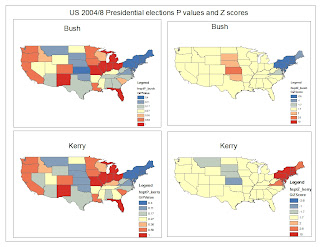
Fig.1. Indicates the P - values and Z Scores for both Kerry and Bush during the 2004 votes
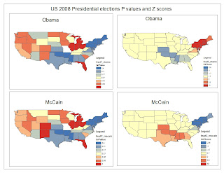
Fig.2. Indicates the P - values and Z Scores for both McCain and Obama during the 2008 votes
Geoda, on the other hand is a very useful tool when it comes to visualizing the correlation between sample. The following figures demonstrate the usefulness of this tool (Geoda).
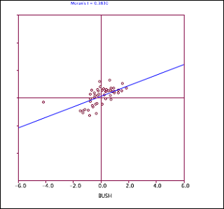
Fig.3 Moran's plot for Bush
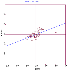
Fig 4. Moran's plot for Kerry
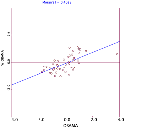
Fig 5. Moran's plot for Obama
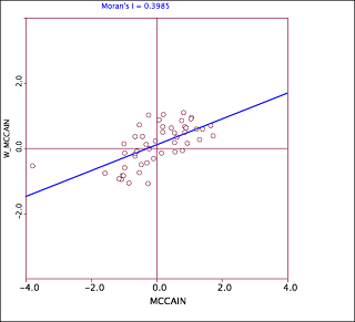
Fig 6. Moran's plot for McCain
R, a statistical language is very useful and powerful when it comes to data analysis. Here, in most cases, the user is limited by his/her imagination. The user has the liberty to choose any kind of plot to display the results. R can also be used to generate map, but it is not very good at that.
Conclusion
Depending on the objective of the project the user has liberty to choose any programme to analyze and visualize data.

No comments:
Post a Comment